Slider/Carousel Block is a universal customizable block that can slide anything — from simple images to complex inner blocks. You can add a slider to anything
On this page we show some examples of sliders with 1 item per slide, you can place any other blocks or complex groups inside each slide.
Slider with inner blocksIt has also custom Slider effect
Slider with custom effectThis slider has also custom arrow buttons, scrollbar and custom sliding effect
Slider as Cards EffectIt has also inner block with buttons as Card
Vertical Slider OrientationYou can change orientation of slider
Full visible items for sliderAlso, this example has Scale effect
Custom control buttons + custom effectAlso, this example has Scale effect
You can also add custom control to slider. For this, place custom elements in the same row as slider and add classes: gs-slider-control-btn gs-slideto-2. This will trigger second slide and class «active» to your control element
Slider synchronizationSynchronize two sliders together
You can synchronize two sliders together. For this, use next panel in Slider options. Each slide has own unique class, you can copy it from one slide and use as control option for another slide. You can use it as direct control and also as reverse (when two sliders synchronized with each other)
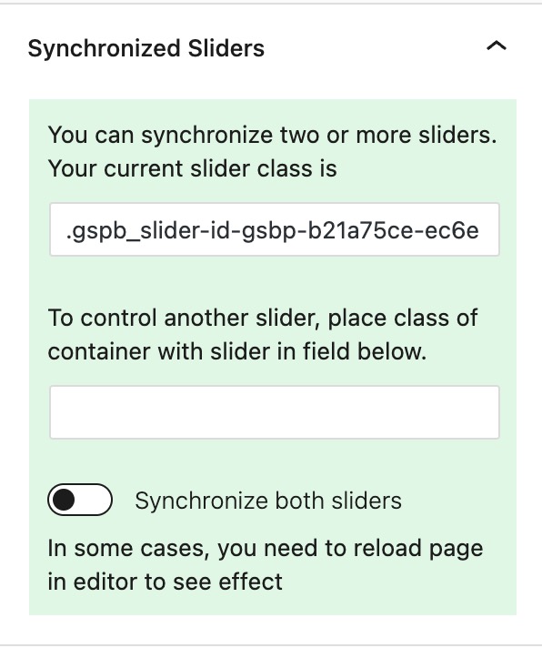
In this example, we use two sliders with different directions
Full page SliderHow to make full page slider
Greenshift slider has some special features like Keyboard and mouseWheel control. This makes it available for such complex things like Full page sliders. Click on image to see the demo

Ken Burns EffectsEasily enable popular ken Burns effect
You can download this slider in Greenshift Library — Experimental. (click on top right blue icon in editor)
Parallax SliderBuild complex parallax effects
To add parallax effect, you need to enable parallax in Slider Image effects panel. You can also add parallax strength for slider images.
You can also add parallax to inner items, for this, select special data-parallax attributes.

Example of slider is available in Library — Experimental

Slider Conversions
For time saving, you can also easily convert regular Core gallery to slider. See how it works in video
You can convert also CSS grid to slider
Slider Synchronization with Containers
You can sync not only slider to slider but slider to containers or accordions. This works based on child items. For example, you have slider with 3 slides. Now, add container and put direct 3 childs to container, add specific class to container in class system and put the same class in Slider option — Container Synchronizations. Now, each child of container is paired with each slide. If you click on second child of container, this will also turn second slide. Also, each slide changing will add «active» class to paired container.
Important. This works better with Loop option and autoplay.
Check demo on Fancy Academy page

Animations inside Slider
You can also add some animations for inner elements in slider. They will be animated only when your slider item is active. For this, you can use Css transform or Animation Container.
Css transform
In Css transform panel, you can set Initial value and Active value. For initial value, set, for example 0 opacity and 40px shift y. For Active state, select 1 opacity and 0 shift.

Another way to add animation is Animation Container, which has Active Slide Trigger

